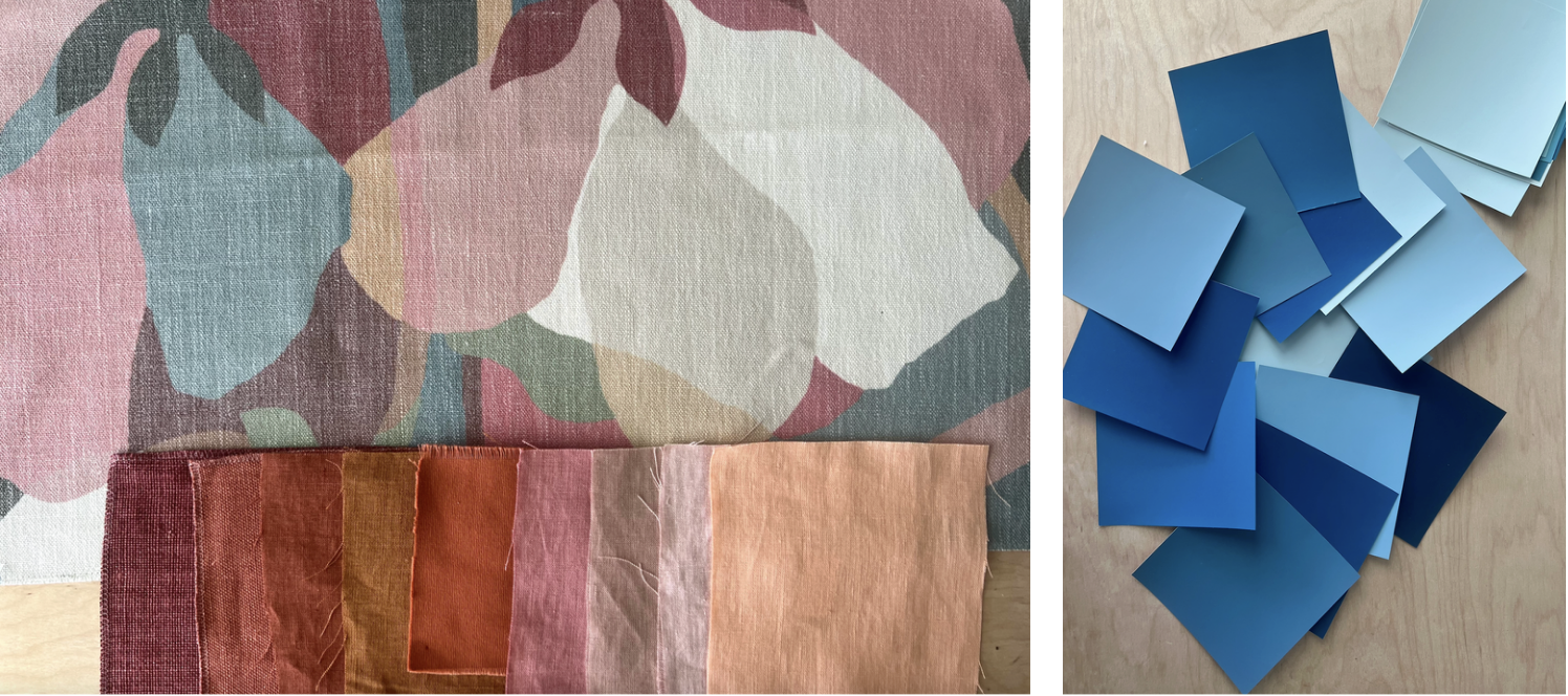
Think About Value and Intensity When Choosing Colors
A shift in color value or intensity can have more of a visual impact than a just a color change. Experiment with layering a variety of samples to find the most dynamic combinations.
When we are picking paint or fabric colors it’s easy to focus on color names and color family names, such as red, blue or green, and overlook other color attributes that have a huge impact on how that color will appear in a setting.
Such as value: how light or dark the color is is equally important to consider. Our eye is drawn as much to a value shift as a color shift. Two colors of a similar value can almost blend into each other, while a big jump in value, such as navy next sky blue, will really jump out and call attention to itself.
There is also intensity to consider: How bright or muted the color is. A muted blue that starts to look a bit more gray, has a very different vibe than a bright blue that feels more energetic and vibrant. We tend to generalize a lot when we talk about color. I often think when someone says they don’t like a color, what they really mean is they don’t like the most saturated version of that color. Brick and fire engine red are both in the red family, but with very different energy and impact.
Every project is asking for a certain amount of drama and harmony, and with these considerations you can intentionally create color stories that feel layered in a way that is pleasing to you. Experiment with combining colors with varying value and intensity and you will discover some beautiful nuances that layer together successfully, and give your space a more unique color story.

