
5 Common Exterior Paint Mistakes (And How to Avoid Them)
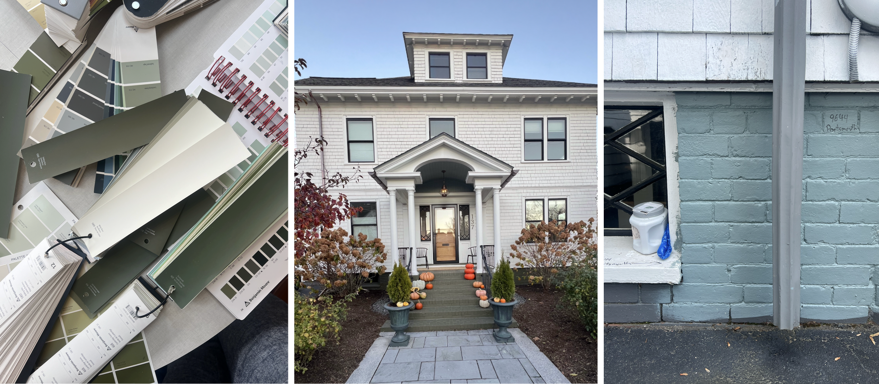
Sample pots of paint colors are a quick and inexpensive way to make sure your colors are working together and flattering your home’s exterior.
Painting your home’s exterior is a significant investment. While it’s tempting to grab a few swatches and dive in, small color missteps can have a massive impact on your home’s curb appeal.
As a color consultant, I see the same five mistakes happen over and over. Here is how to avoid them and achieve a professional, harmonious palette.
1. Pairing Stark White Trim with Muted Body Colors
Bright, crisp whites look best with other clean, saturated colors. When you pair them with dark, muted colors like olive or terracotta the contrast is too jarring.
The Fix: If your house body is a deep, earthy tone, opt for a "dirty" or creamy white for the trim. It will still read as white to the eye, but it will feel much more harmonious.
2. Using Bright White Trim on Brick Homes
Bricks are inherently earthy and textured. Choosing a stark, cool white for the trim does not unify the mill work with the brick body of the house. They kinda clash.
The Fix: Look for warm whites. These tones pull from the mortar, and complement the natural variations in the brick, making the home feel grounded rather than outlined.
3. Painting the Foundation the Same Color as the House
Many homeowners treat the foundation as something to "hide" by washing it in the main house color. In reality, this often looks bland and unfinished.
The Fix: Think of the foundation as an opportunity to elevate the design. Using a deeper or contrasting color on the foundation adds a sense of "weight" and architectural intent, instantly making the home look more elegant.
4. Choosing a Clashing Front Door Color
I love a bold front door, but a high-saturation "electric" color can look awkward against a muted house body. If your siding is a subtle, dusty hue, a neon door will look like it belongs to a different house.
The Fix: You can still have a colorful door! Just lower the saturation. A "dusty" navy or even an “earthy” chartreuse will still pop, but it won't clash with the rest of your palette.
5. Playing It Too Safe with Mid-Tones
This is the most common mistake: choosing a mid-tone color because a deeper shade feels "too dark" on a tiny swatch. Once you get paint under the bright sun, colors wash out significantly.
The Fix: Don't be afraid of the dark! A house can handle much more pigment than you think, especially if it’s nestled in the woods or surrounded by greenery. Always test large swatches outside to see how the sun transforms the hue.
Ready to transform your home?
If choosing the perfect palette still feels overwhelming, I’m here to help. My exterior color consultations ensure your home’s architecture, environment, and fixed elements (like roofing and stone) all work together perfectly. We can even use color strategically to hide the features you don’t love.